MCDONALD’S MICRO ETHNOGRAPHY
In the Fall of 2018 I took an Information Ethnography graduate level course at the University of Toronto’s iSchool. I designed and executed an ethnographic research study about the ordering process at McDonald’s, analyzed the results and articulated my key insights in an ethnography paper.
DESIGNING MY RESEARCH STUDY
I set out to design a compelling research study (with a human computer interaction slant) about a retail space that most people were familiar with– McDonald’s. The following was my initial research topic.
Research Topic:
My research project seeks to understand customer ordering behaviour in one single Toronto McDonald’s locations with digital ordering kiosks. My research questions are:
1. How do customers negotiate between counter and kiosk?
2. How is information communicated to the customer throughout the ordering process? With both over the counter and on-site digital ordering?
3. How do different ordering methods affect social behaviour within the McDonald’s restaurant?
Sensitizing concepts:
- The digital divide and user centred design.
Cutting points:
- Information behaviour and socialization surrounding ordering interactions within one single McDonald’s restaurant during breakfast and lunch periods.
Research Methods:
- Unobtrusive observation & field notes
- Semi-structured interviews
- Diagramming
- Information horizon maps
FIELD WORK
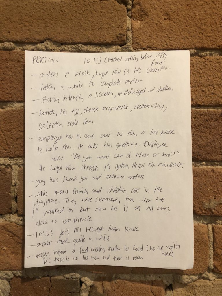
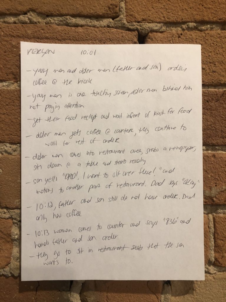
Field Notes
I observed one single McDonald’s location for 4 hours and made extensive jottings which later became field notes. I observed for 2 hours on a Saturday morning until lunch started and 2 hours on a Sunday morning until lunch started. I had 50 pages of field notes. Here are two pages:
Information Horizon Maps
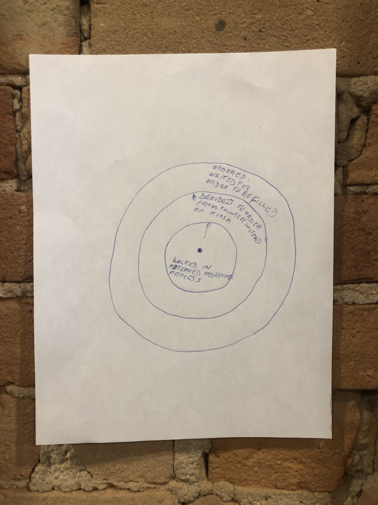
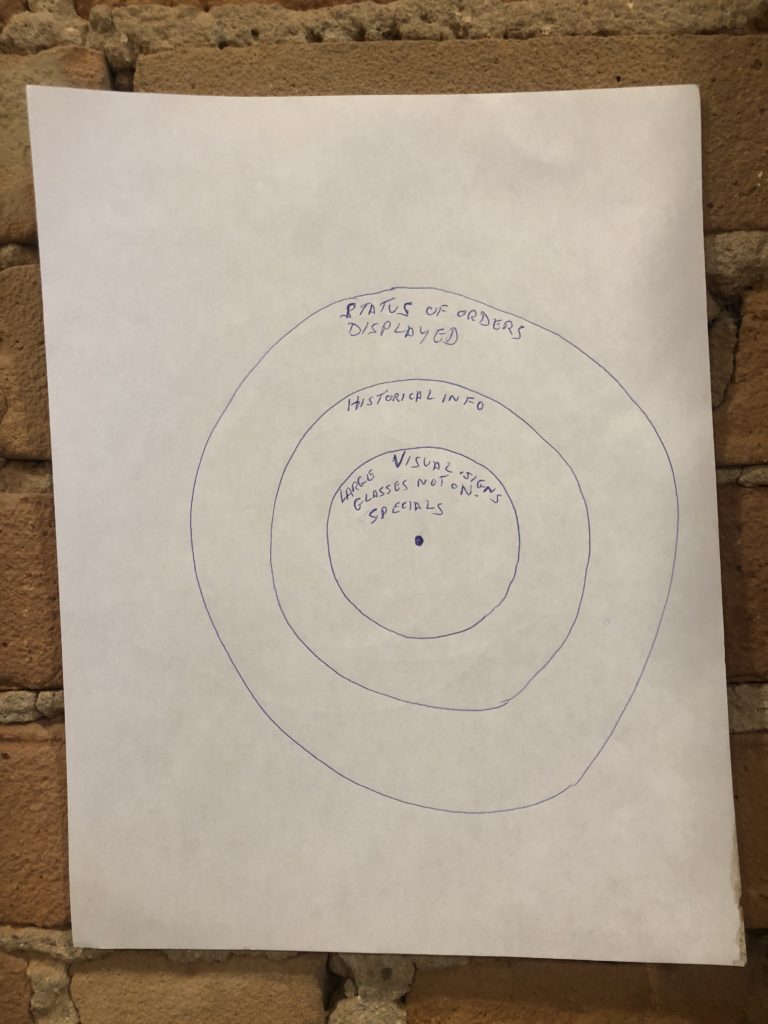
I interviewed 3 customers after they ordered their food. Before each interview started, I asked them to draw two information horizon maps.
- 1 information horizon map to illustrate their sequential ordering process
- 1 informational horizon map to illustrate informational resources they used in the ordering process in order of importance/helpfulness
Diagrams
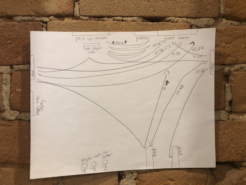
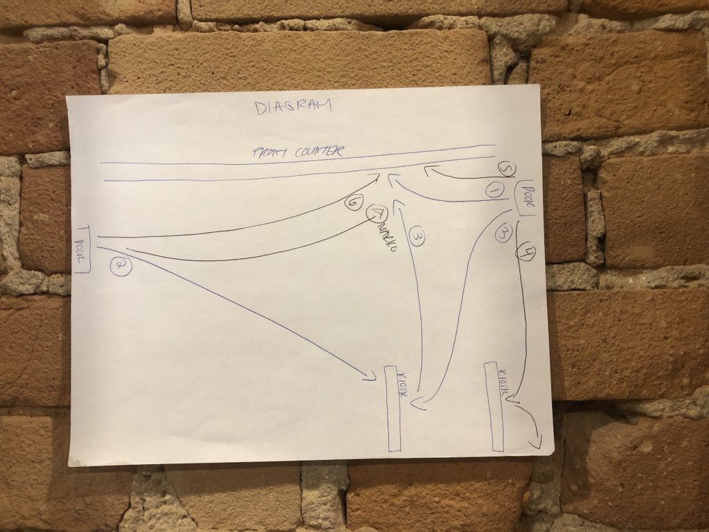
During unobtrusive observation, I also drew diagrams of the movement of each new customer between the front door, the digital kiosks, the front counter and the food pick up counter.
KEY INSIGHTS
- Context: Negotiation between kiosk and counter involved how busy the restaurant was at the time of the order. All three participants articulated that they ordered at the counter because there was no line. Two out of three participants expressed that when there is a line, they opt to use the kiosk.
- Context: All 3 participants did not require much information before they ordered at the front counter either from signage or the staff. All 3 participants already knew what they were going to order before they even walked into the restaurant due to the ubiquity, popularity and history of the McDonald’s menu.
- Context: All 3 participants had previously acquired health related information in respect to the menu items they were ordering. All were aware of the negative health effects associated with menu items. 1 participant, ordered the healthiest items on the menu, the other 2 participants considered their meal at McDonald’s that day to be a health “write off.” They were aware the food was not healthy, but decided to overlook it for that one meal for different reasons
- Demographics (Age): The youngest participant (22 years old) articulated that it was far easier to order at the kiosk. The oldest participant (62 years old) articulated that it was far easier to order with the staff at the front counter. The third participant (32) articulated that he preferred to order with the staff at the front counter. More data would be needed to explore an argument for digital divide based on age, but secondary research suggests there may be a pattern here.
- Elder Shame: The two participants who expressed that they preferred to order at the front counter as opposed to the kiosk expressed age related awareness and shame in not wanting to use the kiosk
- Usability: The ordering process both at the kiosk and the front counter appeared relatively seamless upon observation. The mobile ordering experience (ordering from a customer’s cell phone) was seamless in one case, and completely broke down in another case. Specifics of this breakdown are outlined in the final paper.
The following insights were written about in more depth in the final research paper:

REFLECTION
There are many things that I learned over the course of this project that allowed me to develop as both a UX Researcher and Designer. I think the key takeaway for me is the following:
The fact that this study was not concerned with online interactions themselves (information architecture, user flows etc.), allowed me to focus in on interactions in a small offline environment. In doing this, I was able to explore the ways in which offline dynamics influence the online (and unavoidably, vice versa). The Internet of Things is forcing digital designers to think “outside of the computer” and this project allowed me to do just that.
