DAILY BREAD FOOD BANK: IA REDESIGN
In the Fall of 2018, I worked on a website redesign project for the Daily Bread Food Bank (DBFB) in Toronto, Canada. With a team of 4 other graduate students I:
- Created an initial IA strategy report
- Performed a stakeholder analysis
- Performed a user analysis on the current IA with different user groups using cognitive walkthroughs and semi-structured interviews
- Performed a hybrid card sorting study with different user groups
- Performed tree testing with different user groups
- Delivered a new and improved sitemap to the DBFB
- Delivered medium fidelity prototypes of main category pages
I specifically acted as Project Manager, communicating with stakeholders on a weekly basis, and led all research phases. I also sketched paper prototypes and created the final IA schematic diagram using Omnigraffle.
DISCOVERY
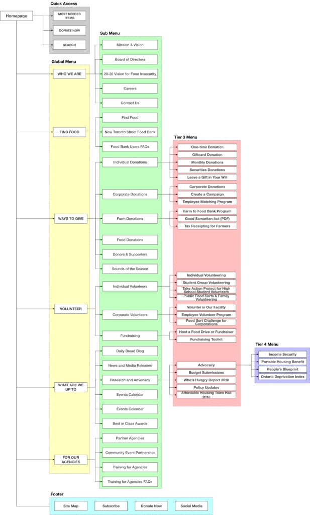
We started by analyzing the Daily Bread Food Bank’s current sitemap.

Next, to find out how we could better optimize the IA, I interviewed stakeholders, determined the project scope and identified problems with the existing site and content. I broke the website’s users into 8 distinct user groups:
- Donors
- Agencies
- Volunteers
- Food Bank users
- Employees
- Media
- Farmers
- Policy Workers
First, I decided that Media, Farmers and Policy Workers workers were outside the scope of this redesign project. Since we were limited in resources (mainly time), I categorized them as peripheral users. Next, I decided to focus on Donors, Volunteers, Agencies and Employees for the first round of usability testing. I felt that these four user groups would give us a holistic birds-eye-view of the functioning of the organization as a whole.
After performing cognitive walkthroughs of different tasks with these 4 user groups on the current site, we identified the key problems and the project scope:
Problems
- Top down IA not user friendly. Website needed bottom up IA with breadcrumb trails
- “Ways to Give” main category was too deep with 6 sub-categories and 16 sub-sub categories
- Sub headings were full of organization specific jargon that users were not familiar with or privy to
- Information on “Ways to Give” pages was redundant or meandering with the same content repeated on several pages
- All users were unable to locate the Food Bank’s “Events Calendar”
- The volunteer portal from this initial test appeared well designed and intuitive
With these insights, we decided to redesign the main categories and sub-categories of the website with a specific focus on the Ways to Give pages.
Research
Card sorting
To help provide more insight into how each user group wanted the site to be categorized, we performed a hybrid card sorting study using Optimal Workshop with the following user groups: Donor, Agency partner, Employee, Volunteer, Food Bank User. The following were our key insights
- Participants mostly adhered to pre-existing categories but were inspired to create sub-categories
- “Ways to Give” and “Volunteer” main categories received high agreement scores among participants (73% and 82% respectively)
- Need Food?” and “For Our Agencies” yielded a low agreement score among our participants (45% and 38% respectively)
- “Cause Marketing” label unclear to all users (even the agency partner who this sub category was relevant to)
- “Good Samaritan Act” label not relevant to any user types tested
- “20-20 Vision for Food Insecurity” only relevant to employee
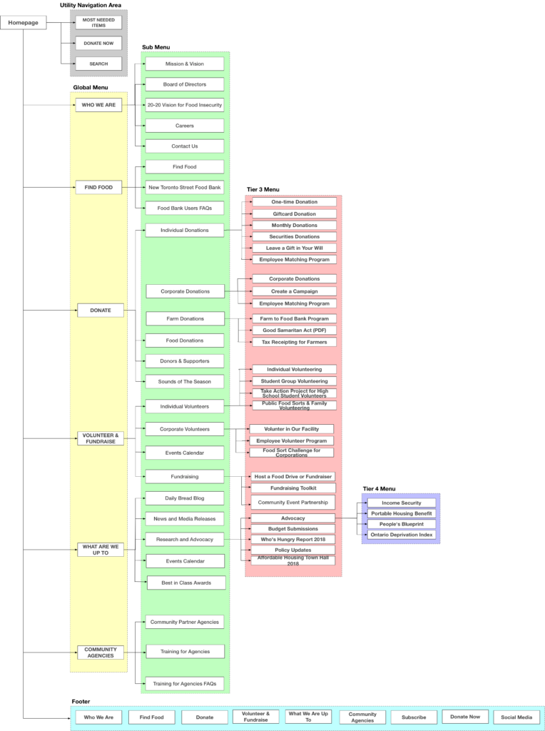
Inspired by the sub-categories that our users created and the challenges that they had in the card sort, we did an overhaul on the sub-categories and renamed two of the main categories to accommodate for sub-category changes. We changed “About” –> “Who We Are” and “Research and Advocacy” –> “What We Are Up To”
We then created a brand new sitemap to reflect the mental models of our study participants and the results of the card sorting:
Tree Testing
After creating our first sitemap, we performed tree testing with the same 5 user groups (Donor, Volunteer, Employee, Agency, Food Bank User) to understand how the new proposed IA would be received by them. We asked each user to perform 8 tasks and analyzed the results. The following changes were made based on our key findings:
- Employee Matching Program was made available under both Corporate Volunteers and Corporate Donations to make this task more accessible and readily available to relevant user groups
- Event Calendar made available under both ‘What are we up to’ and ‘Volunteer.’
- Heading ‘Volunteer’ changed to ‘Volunteer and Fundraise’ and food drive information categorized under this
- “For Our Agencies” main category renamed to “Community Agencies”
- “Ways to Give” main category renamed to “Donate”
DESIGN & DELIVER
With the insights from the tree testing, we created our final sitemap and medium fidelity prototypes of the main category pages with sub-category pages listed.
The following are just some of the medium fidelity prototypes we built.


After writing our final IA report, we delivered the sitemap, prototypes and research to the Director of Marketing and Communications at the Daily Bread Food Bank. We put together a pitch deck and presented our findings in January 2018.
KEY LEARNINGS
- Involve stakeholders throughout the entire redesign process. Get them excited about the redesign and be transparent with your research methods.
- Practice triangulation with your research. Let the data from card sorts, tree tests and cognitive walkthroughs guide you, but not completely govern you. Let interviews and literature reviews provide the context that shades in gaps in the data.