YOLK: RETAIL MOBILE APP
In Fall of 2018, I was Project Manager and Research Lead on a graduate level student project within U of T’s iSchool. As part of a Fundamentals of UX course, with a team of 3 other members, we developed Yolk: a mobile app for the retail space.
We practiced the Lean UX methodology, executed guerilla research and used Figma, Photoshop, Sketch, pen and paper. The following displays our design process and the accompanying artifacts.
PART 1: PROBLEM
We started with a problem.
How does a political consumer easily find products in her area that she feels good about buying? There is currently no local search and discovery tool catering to the political consumer.
Who is the political consumer?
– A young or middle aged person who has become aware of the negative consequences of contemporary capitalism
– A person who is less engaged with traditional elections and more engaged in the choices she has surrounding purchasing products
– A political consumer “votes with her dollar”
– Political consumers often “buycott” companies and products based on a pre-existing or newly learned value systems
Who were we competing against? Yelp

– Yelp is a platform that does not differentiate user segments. Their product applies to everyone
– Yelp predominantly relies on quantitative ratings in its search listings
– These ratings are based on the quality of a product or service within a local business, voted on by the masses
– There is currently no clear and direct way for a political consumer to find value based information about the processes behind the products and businesses on Yelp
– Political consumers using Yelp currently have to type in a search term like “fair trade coffee” and are forced to sift through a series of qualitative reviews to gather information
This was our sweet spot. The following problem statement was drafted soon after.
Problem Statement
The current state of the local search-and-discovery service has focused primarily on targeting all user segments without differentiation and quantitative ratings. What the existing solution fail to address is searching, discovering and curating content based on the qualitative values and causes behind products and businesses. Our product will address this gap by allowing users to easily discover local products/services in their area that support their causes/values. Our initial focus will be political consumers and local business owners in Toronto.
PART 2: RESEARCH
Who are the users we chose to study?
Political consumers in Toronto
Data collection instruments:
- Survey: 77 users
- Interview: 4 users
Local business owners in Toronto
Data collection instruments:
- Interview: 4 users
Summary of research findings
– Survey: 82% users who completed the survey who had habits of political consumption had post-secondary education. 76% of users expressed that cost and a lack of brand transparency stops them from following ethical consumption practices.
– Interview with 4 political consumers: 3 out of 4 users expressed that they preferred to buy ethically sourced products from local businesses. 3 of out of 4 users interviewed were passionate about environmental causes and admitted to altering consumption behaviour based on these causes. 1 user was vegan and was very passionate about animal rights issues, also admitting to changing consumption behaviour for this cause. All 4 users considered themselves minimalists, who do not buy things “they don’t need.” 3 out of 4 participants admitted to doing research online before they invest in buying products and before they visit local businesses in person.
– Interviews with 4 local business owners: All business owners were keen to get the word out about their businesses but were limited in terms of budget and resources. All were passionate about the core values behind their small businesses and wanted their “story” to come across to current customers and potential future customers.
Empathy Map, political consumers (Patricia):

Empathy Map, local business owners (Kevin):

Based on our research, we then decided to focus on Patricia, our political consumer to build our product. We flushed out 5 Needs Statements.
Patricia needs to:
- Find products and/or business that align with her values so that she can consume products without compromising her beliefs.
- Find well-organized information about products/businesses so that she can make an informed decision to buy or not.
- To verify the validity of information so that she feels confident when buying a product
- To conveniently buy products that align with her values so that it is easier for her to follow her beliefs
- To find affordable products that also align with her values so that she can shop ethically within her budget
We chose to focus on the first two needs for our MVP. We ideated big ideas for solutions, voted as a team based on feasibility and impact, and then moved onto prototyping.
PART 3: PROTOTYPING OUR MVP
Iteration 1: Sketches
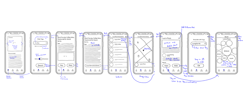
We made low fidelity prototypes based on our research and ideation and then performed guerilla research on these screens with 4 political consumers in Toronto. This is what we found:
Feedback on user flow
– All users expressed that they did not want to be presented with articles or content before they were presented with the ability to discover local businesses or products
– 3 out of 4 users expressed that they wanted the app to do their homework for them when it came to researching products and businesses
– All 4 users expressed that they would appreciate content (articles) about political consumption to be included in the app, but that this content should be peripheral to the main user flow and optional
– Two users felt that the focus of this experience should be centred around finding local businesses that sell products
– Two users felt that the focus of this experience should be centred around finding locally sold products, rather than the businesses that sell them.
Feedback on Review feature
– 2 users did not think the tags in the review page were reviews, but felt they were descriptors. They felt that using the word “review” was not accurate and that this was misleading– that it didn’t fit with their current understanding of reviews
– 3 users also felt the reviewing system in the current user flow was also confusing because they were not sure at the end of the whole experience if they were rating the product, the business or the article that they had read
– All users wanted the ability to post a qualitative written comment
Review tag visualization
– 3 out of 4 users felt this screen was very clear. They understood that this was a visual representation of the inputted tags by other users of the system
– 3 out 4 users understood that the bigger the circle was, the more people had inputted that specific tag as a descriptor
– 1 user was not sure if the circles were bigger because more people had searched that tag or because more people had inputted that tag
– 1 user suggested she would love to see the tag circle visualizations populate as she inputs her tag. If implemented, this would be an example of system progress being displayed visually for the user
Feedback on Favourite button
– 1 user suggested that we change the icon and wording in the master footer from “favourites” to “saved” with another icon. She made the point of saying: “What if there is something that is not my favourite, but I still want to save it for later?”
These findings informed our final medium-fidelity prototypes below.
Iteration 2: Medium Fidelity Prototypes


View interactive prototype on Figma here: https://bit.ly/2CirD1T
PART 4: REFLECTION
- Embrace ambiguity. It will lead you to open-ended discovery. Your problem may shift, your persona may shift, but let the research and users guide you.
- Teamwork makes the dreamwork. We used Edward de Bono’s six thinking hat system to boost productive collaboration. Trust in all members of your team and keep ego’s and “turf protection” in check.
- Tell a story. Communicate your product in simple terms. Make sure your UX logic is sound throughout the entire design process. Show your work in compelling ways and be transparent with your research.